Apples or Oranges?
The news story states that Charity Navigator’s 2012 Metro Market Study “reveals the regional differences in the performance of the nation’s biggest charities.”
The study compares the median process scores on Financial Health (FH) and on Accountability and Transparency (AT) of the largest nonprofits in each of the thirty largest metropolitan areas. The study covers 56% of the 5500 charities evaluated by Charity Navigator, accounting for 67% of both revenue and expenditure of the group.
Using this process methodology, Houston, Kansas City, St. Louis, Cincinnati and Portland are highest rated, while Orlando, Tampa/St. Petersburg, Indianapolis, Milwaukee and Miami are given lowest rating.
We are assured, however, that while there are differences in performance, “the philanthropic spirit is alive and well throughout America.” Does this undercut the intent of the ratings, or just a throwaway, or an acknowledgement that empirical research shows donors only give cursory attention to such ratings when making gifts?
We also learn that regional cost of living, market maturity, support of specialized causes and other factors influence ability to raise funds and manage cost, along, strangely, with adherence to good governance.
Apples, Oranges and Bananas
While Charity Navigator does really good work in its measurement and reporting on processes, there are a number of methodological and substantive problems with their claim of measuring a nonprofit organization’s, a metro area’s and a region’s overall performance. (See my three essays on Measurement of Impact.)
While it is essential to have Financial Health (apples), and equally important to have Accountability and Transparency (oranges), what about results, longer term outcomes and/or societal impact (bananas)? In fact, without those final variables, how can anyone, in my humble opinion, talk about “performance.” I would think, after fifty years in the field, that the substance of performance is more related to that third group of variables than the other two combined. Certainly all three, especially if they all head in the same direction on scores, add up to a powerful measure. But do we know that?
Agreed, we have a fine measure of financial performance; we also have a sense of performance in accountability and transparency. But overall performance?
Relationship of Variables
Charity Navigator has done some intensive work in trying to relate the Financial Health to the Accountability and Transparency variables and has come up with the following simplistic weighting formula:
Source: CharityNavigator.com
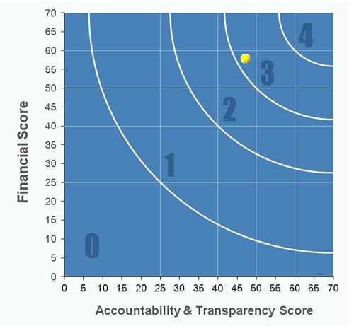
Statistically, this is somewhat helpful, although not totally convincing. The group also tries to simplify this by showing the relationship graphically.
Source: CharityNavigator.com
Charity Navigator rates on the basis of four stars, and that is what the key numbers are above. It might be more convincing to see a scatter diagram of, say, a few thousand scores before one might agree with their formula.
What is one to make of one charity getting a 68FH score and a 43 on AT, earning three stars, and another rated at 45FH and 67AT, also earning three stars? Huh?
To their credit, Charity Navigator intends to add a third major measurement into their system: results. However, until they do, and until they figure out how each of their three areas relate to each other, I would not really think they are getting at actual on the ground overall performance of nonprofits. And so I would take their combined rating score with a large, proverbial grain of salt.
Medians Complicate Things Even More
Adding the dimension of using medians in each metropolitan area, without reporting on range and other variations, muddies the water even more. Median reporting, of itself, just doesn’t cut the mustard when they are used to compare overall “performance” in my opinion, regardless of the operational, empirical definition of “performance” either theirs or mine. (See the essay on Impact Measurement – Part Three.)
For all we know, there may be great nonprofits in the lowest rated metro areas that, perhaps by far, surpass those in the highly rated areas. We just can’t tell from these data. Medians cannot define a whole area until a lot more is also studied and reported.
Actually, we know that there are high performing nonprofits in the worst areas as well as low performing groups in the best areas. Perhaps one organization in the lowly rated areas finds a cure for cancer. How do medians handle that, or, more important, does the designation of a low rated area discourage any potential donors? What, then, does this designation mean for the individual charities in any of the designated areas?
Perhaps, we need to wait for Charity Navigator to come up with that third leg on their rating stool. Perhaps, they might look at some of the other national ratings methodologies, such as the healthiest state ranking of the United Health Group’s Foundation, for some direction. Or, even better, how about adopting some of the epidemiological methodology of the Centers for Disease Control and Prevention?
Charity Navigated gets an “A” for all of their efforts and individual rankings, but quite a lot less for measurement of any region’s nonprofit reality, which is still not known from these scores.


[…] a recent posting on “Apples or Oranges,” I suggested a number of problems with Charity Navigator’s methods in trying to combine […]
[…] its attempts at rating, although I have also been critical of many elements of its system. Like in this recent article where I share my analysis of the rather weak methodology used when the second leg of the stool […]